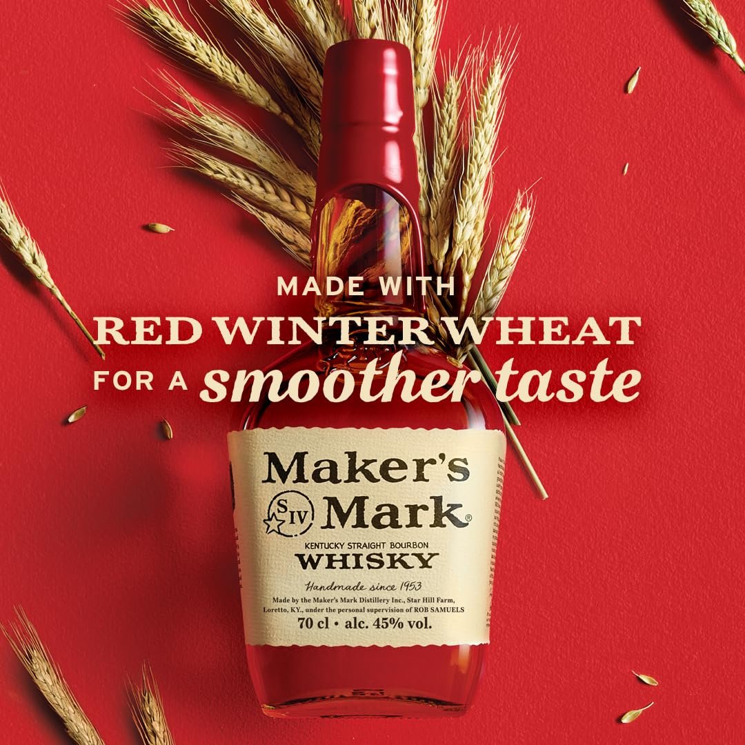
Maker’s Mark: Bringing Red Winter Wheat to Life
The Maker’s Mark global team approached us with a challenge: to highlight a key differentiator in their bourbon—red winter wheat, a unique ingredient that delivers the brand’s signature smooth, soft taste. Our task was to create a compelling communication piece that captured this distinctive quality and set Maker’s Mark apart in a crowded marketplace.

We developed a striking visual concept that combined the iconic Maker’s Mark red with rich, detailed photography of red winter wheat. Careful attention was given to composition, lighting, and texture, ensuring both the ingredient and the liquid were beautifully presented. A thoughtfully crafted headline anchored the design, making the messaging clear, engaging, and memorable.
This versatile creative was adapted across multiple formats—from out-of-home installations to digital campaigns—delivering a consistent and impactful message about the craftsmanship and quality of Maker’s Mark.