Jim Beam RTD Packaging: Refreshing Design for a Modern Market
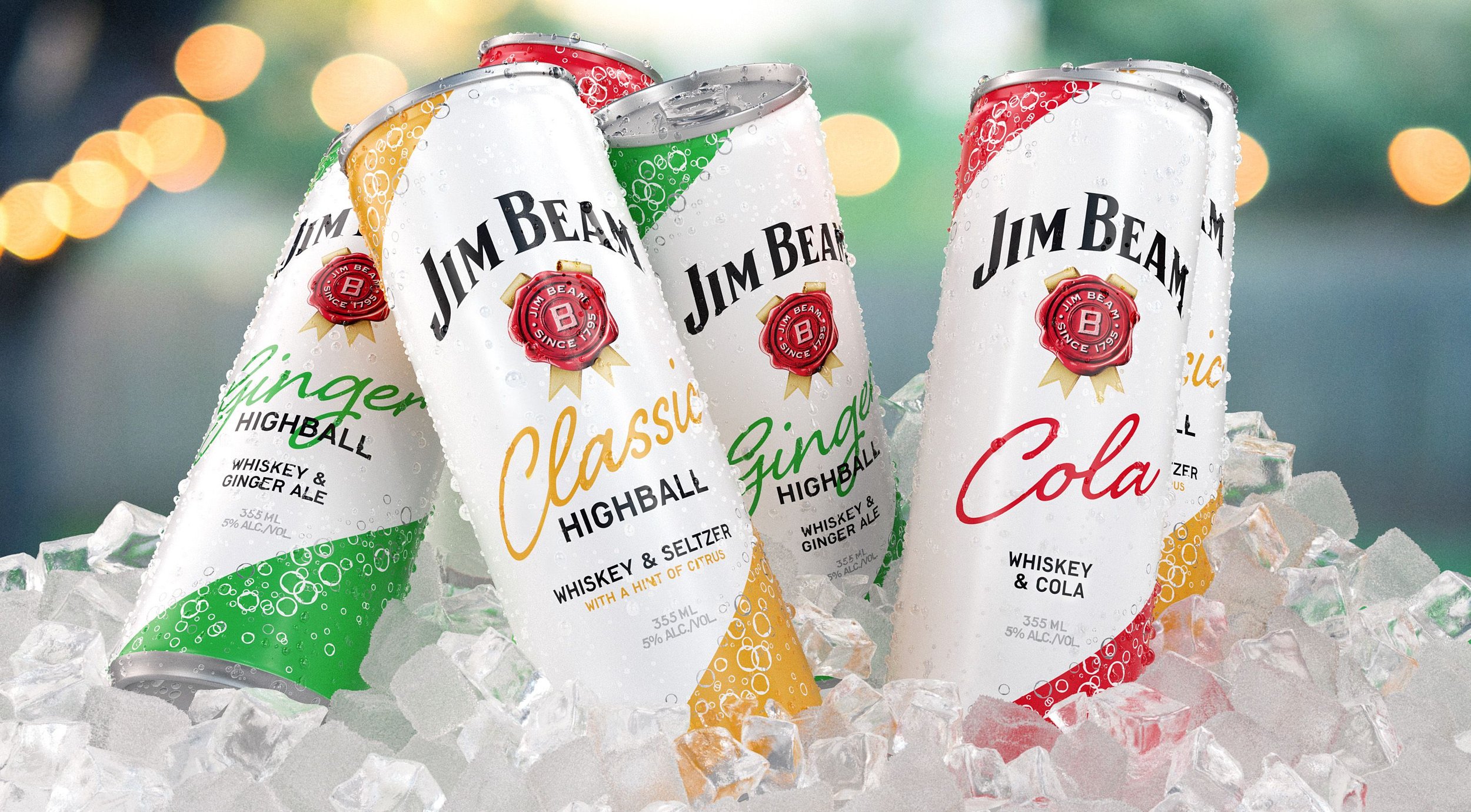
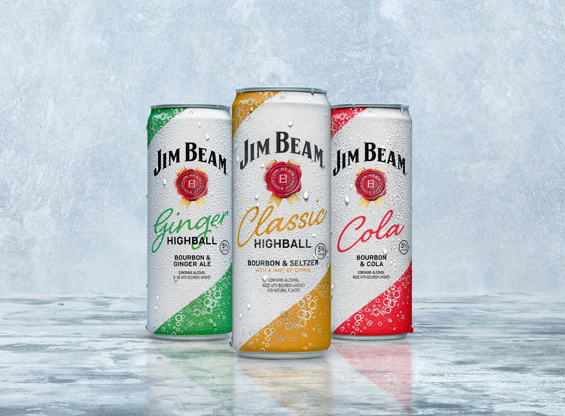
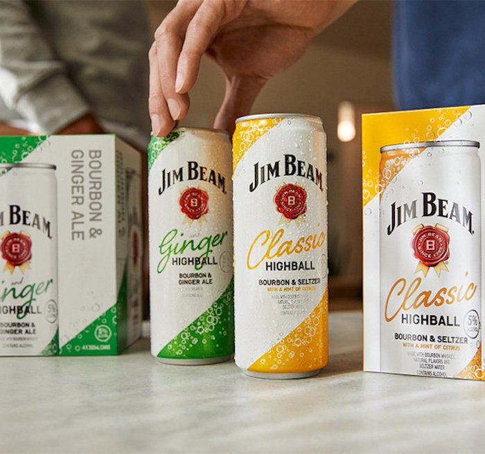
With the rise of the hard seltzer trend, the Jim Beam Global team challenged us to create a fresh packaging concept for their Ready-to-Drink (RTD) range, introducing a new low-calorie, low-sugar highball variant. The goal? A light, refreshing design that stood out on shelves while maintaining Jim Beam’s iconic brand heritage.
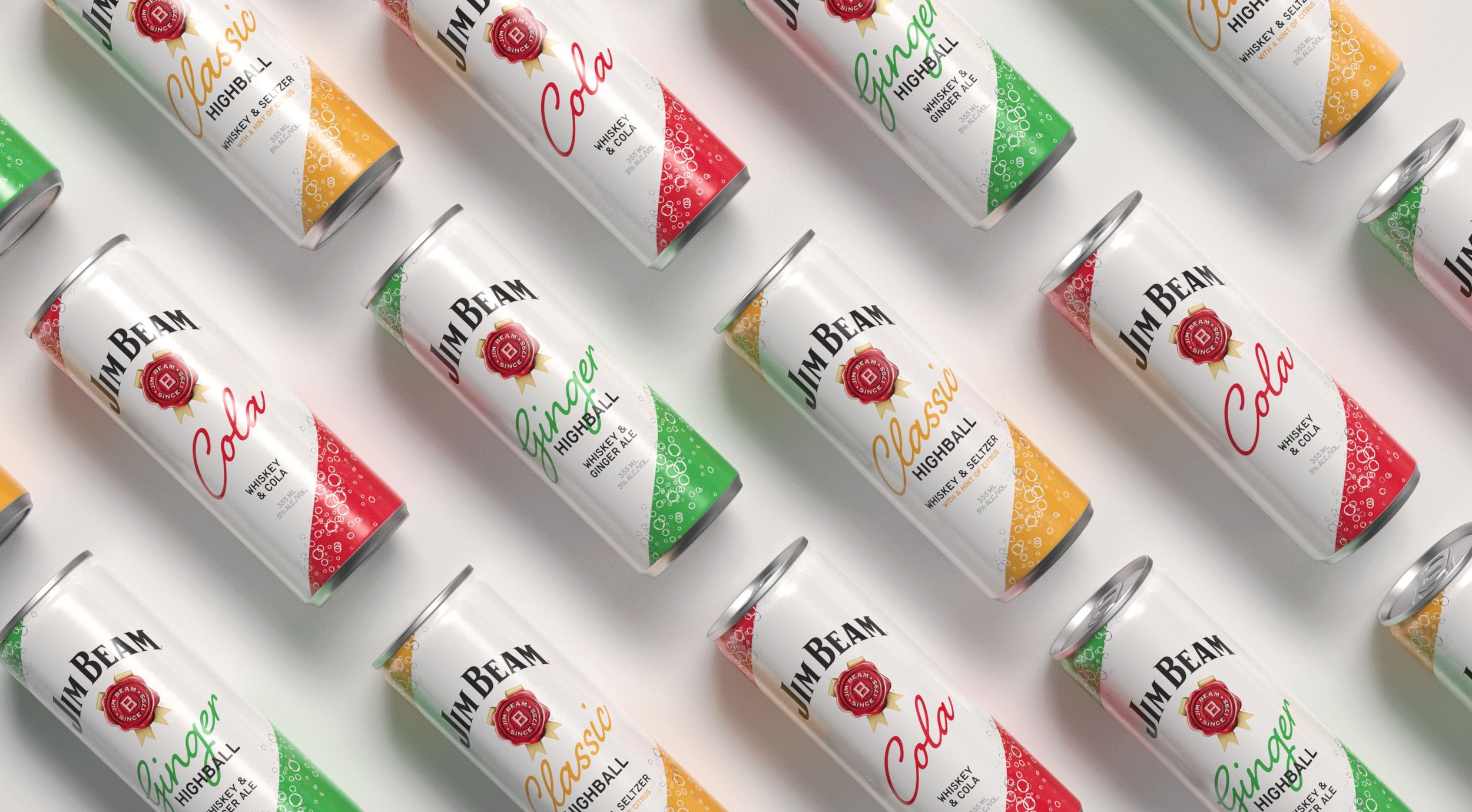
We developed a sleek, slim can design, featuring the signature Jim Beam white base accented with bold, vibrant colors to distinguish each variant. A minimalist bubble pattern revealed the silver base can beneath, adding a carbonation cue and a clean, modern aesthetic.
This design struck the perfect balance—celebrating Jim Beam’s rich heritage while positioning the brand in a fast-evolving, trend-driven category.